MARKETING RAILMO: A FRENIK CASE STUDY
What happens when a hospital analyst takes a deep dive into the budget squandered due to misplaced, unclean, or lost wheelchairs?
In this case, he approaches us with a unique idea and no understanding of how to make it a reality. The request was deceptively simple: partner with a hardware designer to develop a system which tracks equipment and saves the hospital money.
Based on the success of this venture, a brand new company, Railmo, was born. Today they’ve moved beyond just hospital systems to help control equipment costs and inventories for airports and other healthcare providers.
GOAL #1
We designed Railmo to work primarily on a touch-screen tablet interface.
This reduces costs on the hardware side, reduces training time on the software side, and increases accuracy and willingness of use from the user side.
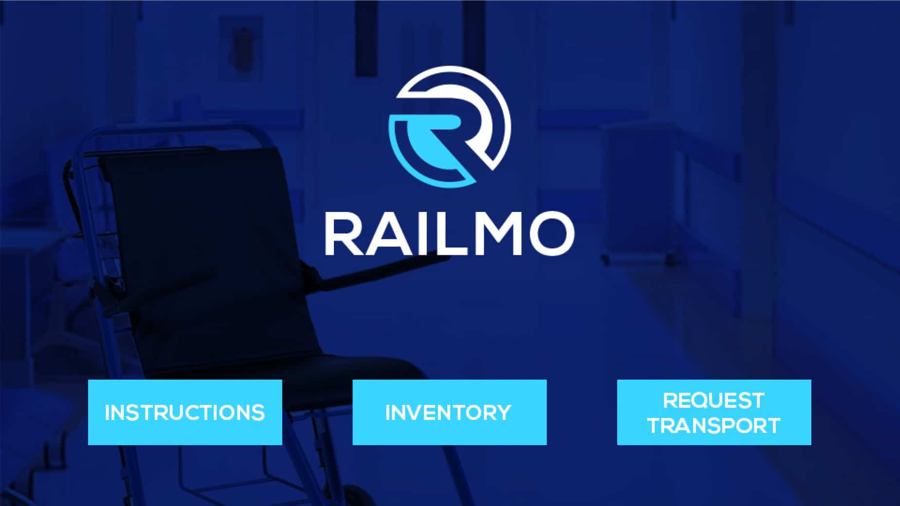
User experience is arguably the most important aspect of any solution like this. The most beautiful, comprehensive design and coding are worth nothing if the end user is intimidated or confused by your app.
The name of the game here was simple and streamlined interface.
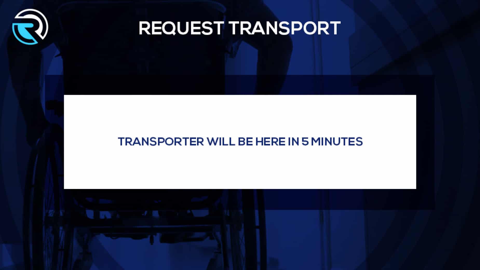
The majority of users would never see the backend of the Railmo system.
Your typical user just needs to understand how to quickly and accurately check out a chair, and check it back in.
The system does the rest.
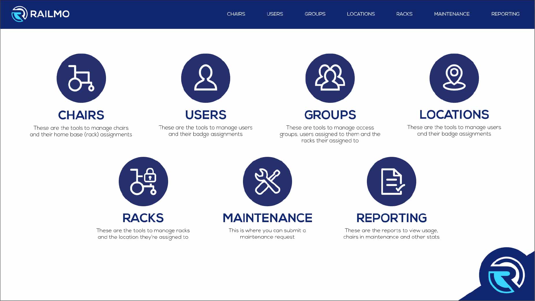
On the backend, simplicity and familiarity are still the keys to ensuring accurate and easy management.
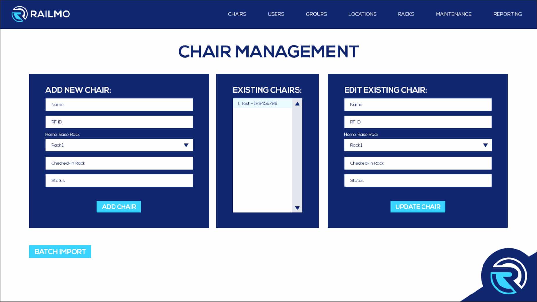
Even drilled down to the most complicated pages, the backend user can easily navigate, manage inventory, change data, and extract reporting on the fly.
There’s never a need to leave the Railmo app.
GOAL #2
In designing the branding for this new company, we wanted to keep the look modern, paying homage to the roots of the original idea of wheelchair tracking. At the same time, we kept it broad enough to apply to additional business types as the company grew.
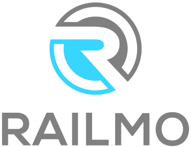
This two-tone mark was a play on the wheel, incorporating a stylized version of the letter “R.”